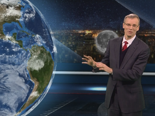
Loading...
logo

WORK

×

Global National

Virtual Set Design

The Global National VR Set design is about excellence in visual storytelling, balanced with the need for versatility to withstand the demands of a daily national news program. Working on a daily set has unique requirements to produce regular segments--design of the set elements, coordination of software, cinematography, and triggering of the virtual elements live are only a few of the challenges that must be met day after day.

The range of pre-designed VR Set elements also needs to be dynamic to illustrate a wide spectrum of stories--from single images, through to complex animations--while maintaining a sense of reality. It is essential to ground the VR Set in a real-world design to maintain levity in the storytelling and further connect the virtual elements with the Talent.

Creative Direction / Art Direction: Beth Mally, Annu Gulati, with Cyril Meusy and Michael Churchill
Virtual Set Design: Cyril Meusy
Daily Virtual Set Design: Beth Mally, Annu Gulati

BC1

Network Show Packaging

I designed the show packaging for three of BC1's new shows that air over the course of a day-- UpFront is a morning program, Afternoon airs just before noon and Prime is an early evening show. The shows were designed in tandem to tie all three together, but use slightly different motion and treatments. The Global News brand shards connect the images and ideas, which flow in one direction, switch directions, or open up like an aperture as the images 'grow' under examination.

Creative Direction: Michael Churchill
Art Direction / Motion: Beth Mally

Decision Ontario

Show Opening

Opening Titles for Global News coverage of the 2014 Ontario Election.

Creative Direction: Michael Churchill
Art Direction / Motion: Beth Mally

SOCHI 2014

Olympic Packaging

Covering the Olympics is always a monumental broadcast challenge. Teams often start a year out before the show, designing openings, features, supers and standings boards. I was one of many designers helping out on the CBC's coverage of the 2014 Sochi Olympic Games by versioning many features, producing them in English and French. Additionally, the Paralympic Games air a week later, and I took much of what was produced for the Olympics and versioned them for the Paralympic Games broadcast.

Creative Director: Doug Temple, Fryden Mezhrad, Michael Burroughs
Motion Design: Beth Mally with Fryden Mezhrad and Michael Burroughs

Splinter Cell: Blacklist

Promotional Material

As a Marketing Artist, supported the launch of Splinter Cell: Blacklist through promo videos released online, and at trade shows such as E3. The primary focus of my work however, was to tell the story of Sam Fischer (the main character in Splinter Cell) through the screenshots of the game. Screenshots are an art form unto themselves-- they must tell the story of the game in one iconic image, never displaying positions or actions that are out of character, while also showing off features of the game and get customers excited about gameplay. It was a challenge I enjoyed meeting every day.

Game Creative Director: Max Beland
Marketing / Brand Creative Director: Jason Wozencroft
Marketing Artist: Beth Mally

Visit

The Nano Revolution

Documentary Series

A co-production between CBC, Japan's NHK and France's Arté, Nanotech is a 3-part documentary series exploring the philosophical, political and ethical complexities of nanotechnology interspersed with short dramas envisioning the future with nanotechnology 30 years from now.

We worked from conception through to production with the Japan/France/Canada team. We tried to envision what future technologies would be in place based on where nanotechnology is in development today.

Conceptual Design / Art Direction – Beth Mally, Terry O'Neill
3D Motion Tests – Caner Salmanli
Opening Title Design – Beth Mally

Visit

FX Canada

Network Branding

FX Canada is a digital specialty channel airing critically-acclaimed FX original series content such as American Horror Story, Wilfred, The League, and Sons of Anarchy. The launch of the channel called for a brand that was big, bold and unexpected. We took the FX Canada tag 'There is no box.' literally and deconstructed it, bringing an unsettling, alien-like behaviour to the glass shards and achieving a robust, cinematic feel with highly reflective surfaces and moody, dramatic lighting.

Creative / Art Direction: Beth Mally with Dean Bender
3D & Motion: Caner Salmanli, Beth Mally.

Visit

One Day

Documentary Special

One Day, 24 Hours, 34 Million Lives

A unique 24 hour portrait of Canada, 1 Day is a special 2 hour documentary celebrating the magic of everyday moments. In a single day, CBC captured the lives of remarkable characters and simeltaneously Canadians in every region provided a glimpse into their lives by filming their day.

Conceptual Design – Terry O'Neill, Beth Mally
Art Direction – Terry O'Neill
Typography: Beth Mally with Terry O'Neill

Visit

Biomuseo

Museum of Biodiversity

A joint collaboration between Bruce Mau Design and Frank Gehry Architects, LLP, the Biomuseo is a museum of biodiversity located in Panama City.

Working with a team of architects and designers over two years, I compiled and designed graphic standards for every graphic design piece in the Museum in two languages (English and Spanish), including signage, book layouts, panel graphics, wall graphics and backlit graphics.

I also designed the last gallery in the Museum, including the main sculpture structure chosen by Frank Gehry.

View

OLN

Network Rebrand

Previously the Outdoor Life Network, OLN is now a channel for outrageous, real-life stories of competition and adventure entertainment. With an audience market of primarily male 30-somethings, the new brand needed to feel rugged but clean and act as a showcase for the outrageous personalities of its shows so we created a custom wordmark, clad it in stainless steel, and paired it with a bright, bold color palette.

Creative / Art Direction: Beth Mally with Dean Bender, Sady Magendran
3D: Beth Mally, Joel Gendron, Sady Magendran
Motion: Beth Mally

View

The Nature of Things

50th Anniversary Redesign

The Nature of Things with David Suzuki

Conceptual Design / Art Direction – Terry O'Neill, Beth Mally
Design – Terry O'Neill
Opening Title Animation – Tango Media Group www.cbc.ca/natureofthings

View

Love Hate & Propaganda

Documentary Series

A bilingual production between CBC and Radio Canada, Love Hate & Propaganda is a 6 part documentary series about the role propaganda played during World War Two. Hosted by The Hour's George Stroumboulopoulos it is a primer on the art of mass persuasion, aimed directly at a media-savvy generation.

We were involved in the process from conception through to filming, production and dvd distribution and created a unique way of working with editors and designers to weave the graphics throughout the series.

We were nominated for a Canadian Gemini Award for our Art Direction on the series.

Conceptual Design / Art Direction: Beth Mally, Terry O'Neill
Motion Design: Beth Mally, Terry O'Neill, Marika Gal, Tom Hall, Sang-mi Jeong
Typography: Beth Mally
Opening Title: Sang-mi Jeong with Beth Mally, Terry O'Neill

View

The Nature of Things: 50 Years

Anniversary Special Concept Boards

The Nature of Things:
50 Years
Opening Titles Style Boards

Conceptual Design / Art Direction – Terry O'Neill, Beth Mally

Toronto Blue Jays

Season Promo

Creative / Art Direction: Dean Bender, Sady Magendran
3D / Motion: Caner Salmanli, Beth Mally, Sady Magendran, Donna Norman, Nick Kingsland
Keying: Caner Salmanli, Beth Mally
Compositing: Caner Salmanli, Beth Mally, Sady Magendran

Love Hate & Propaganda:
The Cold War

Documentary Series

A continuation of the highly successful series, Love Hate & Propaganda: The Cold War is a 4 part bilingual documentary series hosted by The Hour's George Stroumboulopoulos about the role propaganda played during the ultimate psychological battle between the democratic and capitalist west led by the United States and the communist world dominated by the Soviet Union.

Again, we were involved in the process from conception through to filming and production, creating an extensive toolbox of techniques for designers and editors alike.

Conceptual Design / Art Direction: Beth Mally, Terry O'Neill, Joel Gendron
Motion Design: Beth Mally, Terry O'Neill, Joel Gendron, Caner Salmanli, Tom Hall, Mike Burroughs
Typography: Beth Mally
Opening Title: Beth Mally, Caner Salmanli

View

Art Gallery of Ontario

Rebrand

Brought in the Design Phase of the rebrand, I spent a month working closely with Bruce Mau, producing many varieties of logo treatments to create a unique signature for the AGO and the Design Standards for the brand.

Conceptual Design: Bruce Mau Design Studio
Art Direction: Beth Mally with Bruce Mau
Graphic Design: Beth Mally, Kelsey Finlayson

View

CityTV New Year's Eve

Show Packaging

Creative / Art Direction: Beth Mally with Dean Bender, Sady Magendran
3D: Caner Salmanli, Beth Mally
Motion: Beth Mally, Margaret Lee

Gagosian Gallery

Collateral Design

One of the preeminent contemporary art galleries in the world, the Gagosian Gallery identity consists of clean, clear typography and unique square shaped invitations to show openings. Always trying to keep the invites fresh and unique, the boundaries of the square were constantly being tested, sometimes veering completely away from the shape while rigidly adhering to the sensibility of the brand to keep it legible.

Highlights:

Andy Warhol & Jean-Michel Basquiat
This invitation featured the work of a 6' high piece, and because of it's size, it seemed inappropriate to fold the image. Instead, the piece was rolled into clear mailing tubes, keeping the invitation itself visible. When unfurled the piece could be hung on a wall, mimicking the verticality of the original work.

Richard Wright
The artist himself sent a piece he wanted to be reproduced as his invitation. This proposed particular fold and die-cut challenges as well as the question of where to print the actual invite. The solution was to print the invitation on clear acetate and tuck it into the piece.

Richard Artschwager
The Richard Artschwager invitation was a folding scale model of the piece it featured. It was named one of the top 10 invites of 2002 by Art on Paper magazine in New York.

View

Lepanto

Gagosian Gallery Catalogue

This book was a redesign of a previous catalogue for the same body of work. Depicting the battle of Lepanto, the last major naval battle between galley ships in 1571, the concept for the book was to enhance the context of the paintings. The battle was reportedly so heavy, the sea ran with blood and so the book itself is covered in bookbinders cloth, a material reminiscent of bandages, and blood red end pages hint at the destruction the paintings depict. The title of the book is also printed in a soft grey underneath the bookbinding cloth to allude to the fog of battle, while within, a 4-page detail of one painting as it drips down the canvas gives the reader a visceral, detailed view of the artist's work.

Art Direction: Beth Mally with Bruce Mau
Graphic Design: Beth Mally

View

Collaboration Paintings

Gagosian Gallery Catalogue

Art Direction: Beth Mally with Bruce Mau
Graphic Design: Beth Mally

View

ABOUT

Beth Mally has an extensive 18 years of experience in art direction, design & typography, and has worked on a wide range of projects in broadcast, motion design, advertising, identity packages, books, and exhibits.

She is currently working on her first scifi novel.

KEEP IN TOUCH

©2015 Beth Mally